The good, the bad and the downright ugly of building a mini collection

Building out a mini collection for me comes with a multitude of emotions and a rollercoaster of self belief.
First we start with excitement - this is a fresh new trend idea and I’m looking forward to playing with the colours and creating a beautiful concept.
Only I can’t quite see it yet, it’s there on the periphery of my creative vision but it’s blurry.
Time to jump in with some market research find the ‘look’ and sketch out some graphic concepts.
Next, enter disappointment fused with mild anger. I can’t believe I thought this would work. Why are the colours so terrible? I’m never going to create anything good ever again I’m just not good enough.
Follow that with throwing ideas at the page even if they ‘don’t fit’. A heavy dose of dithering, fiddling incessantly with the colour palette going in and out of the graphics. Stand up. Sit down. Walk around.
Pushing through the bad, the really bad and the ugly.
Fuel it all with a steady stream of tea.
Then things start to appear. Colours get exciting again. Graphics take shape. Outfits are built and patterns layered in.
The collection has appeared.
From my experience working with other designers, I don’t think its uncommon to have this ‘round the town’ way of creating. Ideas bubble up so quickly they can be hard to grab hold of completely on the first try, that element of space and time away from creating breeds better design.
Maybe other designers are able to jump right in and whip up the graphics in minutes flat but I can’t say I’ve met them.
The beauty and the composition comes in the sketching around the edges playing with colour and generally fiddling until the perfect balance is found. I’ve found it leads to a higher hit rate than if I jump right in and plonkily follow a formula, but maybe that’s just me. Of course, there are also those Friday afternoon crazies that hit with a quirky edge and what turns out to be a best selling design comes out of nowhere - cue me kicking myself for passing it over when I have to design a ‘version’ of it in seasons to come and am just not in that crazy zone - time to power through with a bar of fruit and nut.
That’s it in a nutshell, my ‘process’, and here’s a peek behind the curtain and some of those out-takes before I show you the finished collection.


Through the good, the bad and the ugly the collection appears.
This time around I found myself drawn off the colour palette path completely with a fresh chalky brights palette before I headed back over to the modern tractor theme.
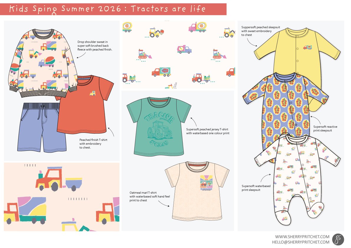
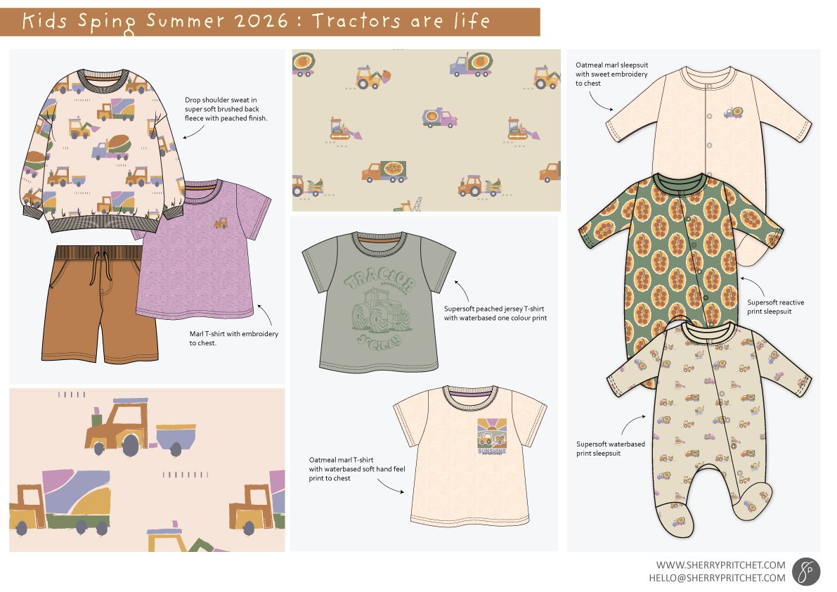
Which led me to tweaking my original palette slightly adding in that softer level while grounding it with khaki and oatmeals.
Which take do you prefer?